React Native Toast
A lightweight, customizable toast message component designed for React Native. Keep your app notifications clean and simple.
Features out of the box
Lightweight
A small footprint component with no external dependencies to bloat your React Native bundle.
Customizable
Fully customize the toast appearance including background, text styles, duration, and more.
Global Manager
Trigger toasts from anywhere in your app using the simple showToast function.
Tap-to-Dismiss
Users can easily dismiss notifications by tapping them, or they can wait for the default timeout.
How to use
1Installation
2Mount Component
Place the Toast component at the root of your application to ensure it overlays all other screens.
import React from 'react';
import { Toast } from 'au-react-native-toast';

const App = () => (
  <View style={{flex: 1}}>
    {/* Your App Content */}
    <Toast />
  </View>
);3Show Messages
Use the globally exported showToast method to display your messages.
import { showToast } from "au-react-native-toast";

// Display a basic message
showToast("Profile correctly updated!");

// With a custom duration (5s) and styling
showToast(
  "Success!",
  5000,
  true,
  { backgroundColor: "green", borderRadius: 10 },
  { color: "white", fontWeight: "bold" }
);API Documentation
showToast(message, duration?, pressToDismiss?, containerStyle?, textStyle?)| Parameter | Type | Default | Description |
|---|---|---|---|
| message | string | Required | The text to display in the toast |
| duration | number | 3000 | Time to show the toast (in milliseconds) |
| pressToDismiss | boolean | true | Allow dismissing toast by tapping |
| containerStyle | object | {} | Custom container styles |
| textStyle | object | {} | Custom text styles |
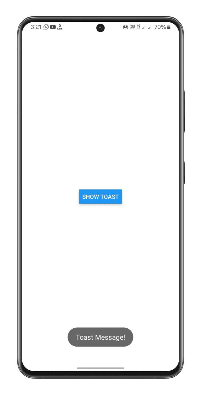
Try the Snack Demo
Want to test it out before installing? Check out the interactive Expo Snack from your web browser or Expo Go app.
Open Expo Snack